Sooo since there was a much better reception for my editing tips post, I feel less awkward trying to put this one together. I’d still like to be able to do actual video tutorials, but it’s something I’m still struggling with, tbh, so here’s this instead (rather than having nothing at all).
This tutorial does require having a graphics tablet. I know this isn’t as accessible to everyone, but I have absolutely no clue how to achieve this or even a similar look without it.
There is no exact science to how I edit my screenshots, tbh, but there is a general work flow I go through that has developed over the past year or so of me doing these.
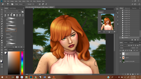
The hair can be broken down into 3 steps: color blocking, shaping, and minute details. It is essentially going form the largest details down to the smallest. And I generally use the shape already given by the base hair. I tend to start on this after I’ve done all the initial prep work: cutting the sim out from the background, cleaning up the edges, stuff like that. So. I’ll be using this hair as an example:
1. Blocking/Giving Yourself A Base
First, give yourself a new layer. This makes it easier to basically trace what’s already there (it’s your guide tool), and making mistakes isn’t as big of a deal.
I take the eyedropper tool. You want to find a medium shade in what your base screenshot already gives you and then also a darker shade (but not the darkest). Then, you paint that medium shade all over most of the hair. I take the darker shade and paint over the sections of hair that are obviously in shadow (usually what sits closest to the neck; I do it for depth perception).
2. Adding Shape + Direction
Here you use the darker shade to outline where there are chunks of hair. To make it really easy, make the layer you’re working on about 50% opacity and just trace the base screenshot.
Where the hair is lighter + darker is influenced by where your light sources are. My light source here is in the top left corner. The sun, basically.
I’m always swiping my brush in a downwards motion, following the flow of the hair. That’s pretty important, imo, to getting hair to look like hair. You gotta feel it.
3. Adding Additional Shape and Direction
More of the same. We’re starting with the large, blob block of color and building up the details from largest to smallest, always in that order.
With the third step, we start using progressive lighter (I move diagonally on the color box, not straight up) and darker oranges in order to produce a more 3D effect. If you’re confused about the colors, just pick them with the eyedropper tool.
I haven’t changes brushes once yet, btw.
This is what the hair looks like after I’ve worked my way from step 1 to 3.
For the final stretch, I switch to a hard brush and conservatively apply it in the ends (to give the impression of individual hairs) in the darkest shadows and in the lightest highlights. It’s difficult to gauge and easy to go overboard, so you might be undo-ing a lot of your mistakes until it looks the way you want it too.
The idea here isn’t to draw a bunch of individual strands of hair. We’re going for a more “maxis-match” feel, so we want to retain the cartoon chunks rather than opting for a more realistic style.
3.5 Note on Hue/Saturation
I’ve had edits before where the colors choices I made were not quite what I was hoping for, so to tweak the undertones a little, I go into hue/saturation (I’ve done it with color balance, too). To do this without messing up the rest of your screenshot, I make the other layers invisible first, and then make adjustments as I see fit. You will have to merge it down before you make the other layers visible, though, or the adjustments will affect them, too. If you don’t like how the adjustment looks, just undo the merge and readjust until you like it.
Be careful not to go too wild with this, though. It’ll “fry” the texture if you do, and you’ll need to lightly go through steps 2-3 in order to re-achieve the softer look again.
4. More Highlights + Shadows
Once steps 1-3 are done, I move on to the skin + clothes. It’s only after the rest of the screenshot is touched up that I move on to adding highlights + shadow to create more depth. I went over my process here, and it extends to the hair as well. Dark navy + white (or basically white), with a soft brush at about 50% opacity. This is less about shape and more about adhering to where the shadows and highlights fall on the hair. I opted for an “anime” highlight on the hair.
And that’s how I do it. Hope it was helpful. I know people are curious as to my process.